Product Designer
I design systems and experiences
that make complex decisions
feel simple
Most of my ideas start in real life — usually while creating experiences for the people around me.
Selected work
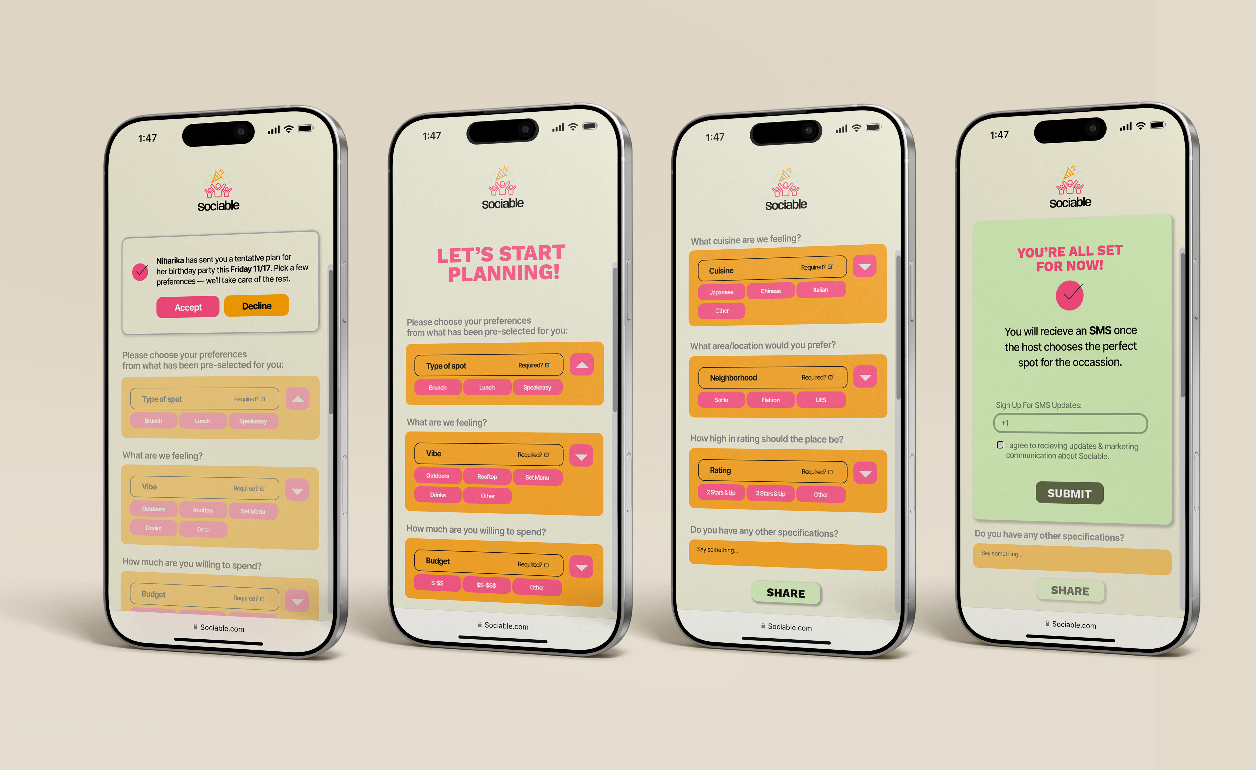
Sociable
Plans that actually make it out of the group chat. A collaborative social planning app that replaces the endless back-and-forth between Maps, Yelp, and the group chat.
Designing Campaign Systems
Reworking how high-volume promotions are structured, surfaced, and experienced on the homepage during Star Deals Week.
Scaling Promotional Templates Across Campaigns — Macy's
Building a scalable template system so high-volume promotions could be produced consistently, quickly, and without starting from scratch every time.
Wedding Identity & Experience Design
A design system applied to a real-world experience — the same principles of modularity, hierarchy, and scalability used to design a 3-day, 6-event South Indian wedding in Hyderabad across 13+ touchpoints and 400+ guests.
Sociable
Plans that actually make it out of the group chat.
Every friend group knows this moment:
"I'm down for whatever."
Which usually means one person ends up planning everything — figuring out what everyone is actually not down for.
What should take 10 minutes turns into hours of back-and-forth, jumping between Google Maps, Yelp, TikTok, and Instagram.
And somehow... you still don't have a plan.
What makes group planning so hard?
Too many choices
Especially in cities, the options become overwhelming
The "vibe check" is real
Happy hour, dinner, drinks — it doesn't work for everyone
No one wants to take charge
So the same person ends up doing all the planning
Effort is uneven
The same person always ends up doing it
Group chat silence
No replies… until it's the wrong plan
Choice fatigue
Too many options with no clear way to narrow them down
"We talk about plans more than we actually make them." — Niki, 25
Interviews conducted
6
on group planning
Rely on one person to plan
83%
in their group chats
Switch apps per session
4+
during group planning
Said plans fall through
67%
due to no response in group chats
App
What it does well ✓
What it lacks ✗
Beli
Strong social recommendations
→ Not built for real-time group planning
Yelp
Huge database, reviews
→ Overwhelming and not collaborative
Google Maps
Navigation + discovery + AI search
→ No shared context or decision-making
These tools help you find places — but not decide together.
Apps per plan
3+
Decision making
10 min → 1+ hr
Plans for everyone
1 person
So I designed around this instead —
Make collaboration visible
Everyone should see what's happening — not just the planner.
Keep everything in one place
No switching between apps mid-plan.
Make participation easy
Tapping is faster than typing. Lower the barrier to reply.
Make planning feel fun
The process should feel just as enjoyable as the plan itself.
Putting pen to paper
Starting from scratch
Exploring how group planning could work. Ideas were loose, unstructured, and all over the place.
→ Needed to turn concepts into something usable
V1
Exploring structure
First pass at the core screens — figuring out where things should live and how people move through them. It started to take shape, but felt heavy and disconnected.
→ Needed clearer structure and hierarchy

V2
Defining the system
The app started to feel like itself — but the flow still felt more like a form than a conversation. The experience was rigid where it needed to be flexible.
→ Needed to feel more flexible and social

The final direction
Experience from "what should we do?" → to "see you there"
Brought everything together into a more cohesive experience — making planning feel faster, lighter, and more collaborative.
What makes this work
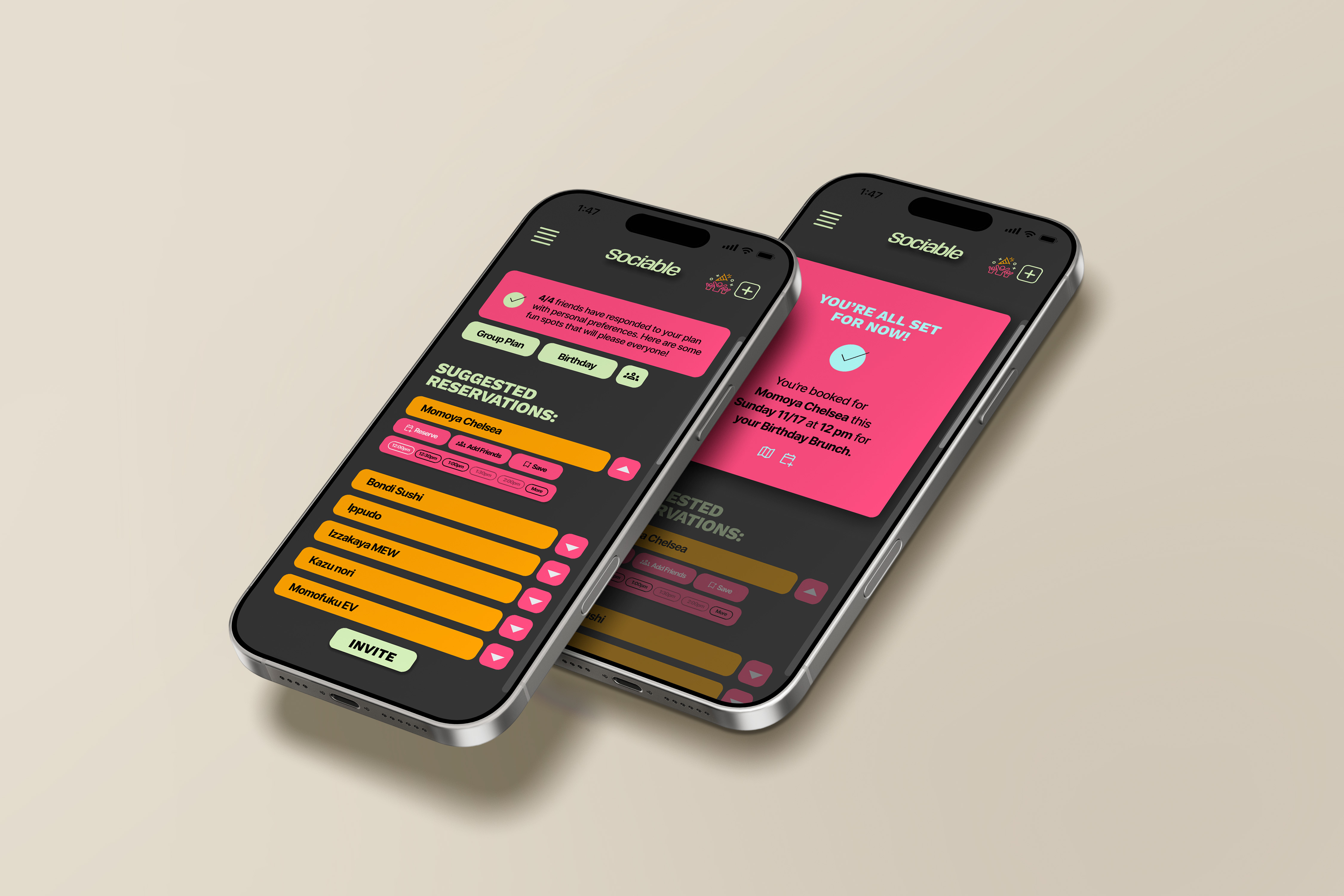
Group planning hub
→ Everything lives in one shared space
Collaborative decisions
→ Vote, react, and move plans forward
Interactive feed
→ Discover spots your group will like
Calendar integration
→ Find a time that actually works
Extending the experience beyond the app
Planning doesn't end once a plan is created — it only works if everyone actually responds.
Most tools assume everyone will download the app.
In reality, people just want to click a link and move on.
So I designed a lightweight browser-based flow for friends
to quickly weigh in — no friction, no commitment.
Turning responses into a plan
No more — "I'm down for whatever"
When the votes are in, the answer is obvious. No more chasing people up or re-reading a thread to figure out what everyone actually said.
Where this could go next
Real-time collaboration
Right now it's async — the next version should feel live, like everyone's in the room together.
Scaling across group sizes
A dinner for four is very different from a birthday weekend for twelve. The system needs to flex.
Availability + reservations
Once you've picked a spot, you shouldn't have to leave the app to book it.
Notifications help prevent plans from stalling
Plans die in silence. A well-timed nudge keeps things moving.
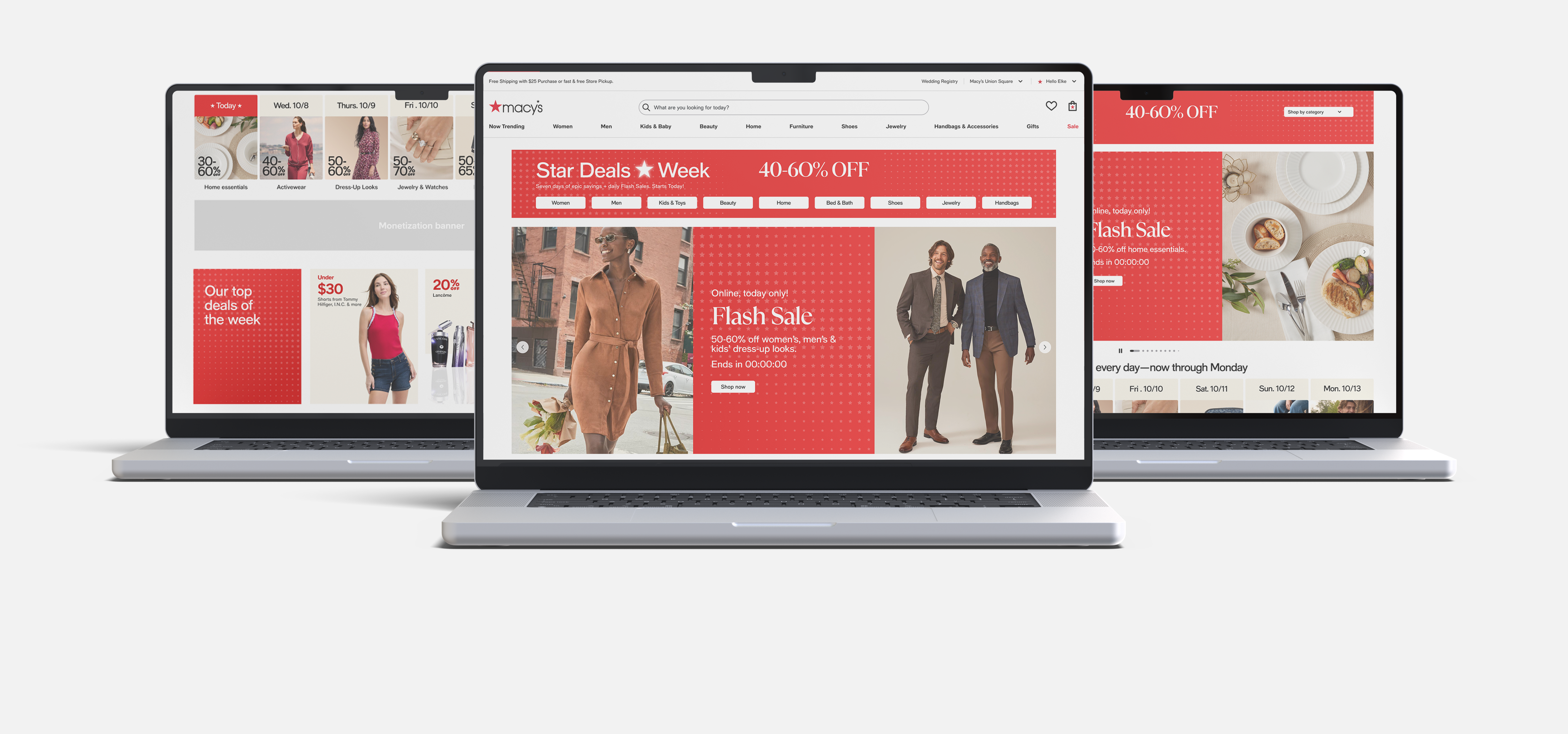
Designing Campaign Systems at Scale
Star Deals Week — Macy's
Reworking how high-volume promotions are structured, surfaced, and experienced on the homepage.
What this project needed to solve
Star Deals Week is one of Macy's most content-heavy campaigns — with multiple daily offers, changing promotions, and high visibility across the homepage.
The existing experience struggled to keep up. Content felt crowded, hard to scan, and difficult to navigate.
The goal was to create a system that could scale — without overwhelming the user.
Where things were breaking down
→ Too many promotions competing for attention
→ Weak hierarchy made it hard to scan quickly
→ Vertical stacking created long, fatiguing scrolls
→ Users lacked clarity on when deals were relevant
→ Key CTAs were easy to miss within dense layouts
My role
I worked on the homepage campaign experience — figuring out how to make a page that changes daily, carries a huge amount of content, and needs to drive action actually feel manageable to shop.
I worked closely with content, marketing, and dev to make sure the patterns we landed on held up across the full campaign, not just a single moment.
Design approach
— Cut through the clutter — one clear thing at a time
— Make it obvious what matters most before anything else
— Design for someone giving it two seconds, not two minutes
— Build something that works whether there's one deal or twenty
— Stop burying the thing people actually need to click
The design
Evolving the system
System move 1
Condensed high-volume offers into scrollable systems
Instead of presenting everything at once, content was restructured into a more digestible format — users could quickly scan and engage without feeling overwhelmed.
→ Shoppers were scrolling past deals they actually wanted. This fixed that.
System move 2
Replacing long scrolls with structured slideshow modules
Vertical stacking was replaced with a slideshow-based approach, making it easier to browse multiple deals without excessive scrolling.
→ A more controlled, less fatiguing way to browse a lot of deals at once.
System move 3
Introduced temporal clarity through a calendar module
A calendar-based component helped users understand when deals were active — adding structure to an otherwise time-sensitive experience.
→ Star Deals runs for a week. People needed to know what was on today, not dig for it.
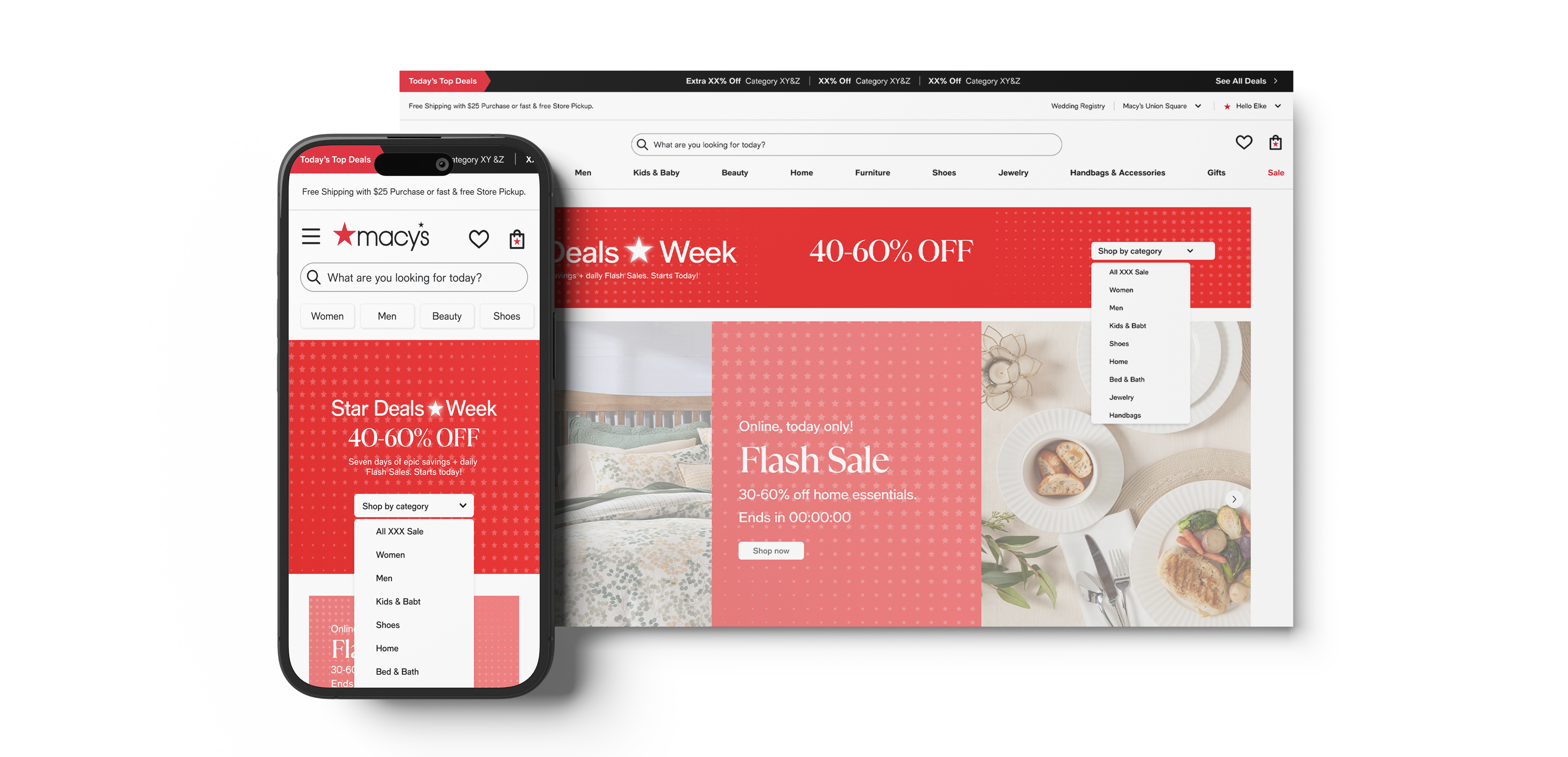
System move 4
Tested progressive disclosure for CTA clarity (A/B test)
Collaborated on a dropdown CTA variation to replace cluttered multi-CTA rows, preserving category access while reducing visible noise on mobile.
→ Fewer things on screen meant the one thing that mattered was easier to find.
The final experience
Designed to feel clearer, more structured, and easier to navigate at scale.
Key design decisions
→ Prioritizing hierarchy over volume
→ Structuring content into modular systems
→ Designing for scannability first
→ Balancing visibility with simplicity
Impact
— More structured and scannable homepage experience
— Reduced visual clutter across campaign modules
— Improved clarity around promotions and timing
Key learnings
— Designing for scale requires restraint, not more elements
— Clear hierarchy is critical in high-density experiences
— Systems thinking is more valuable than one-off solutions
If there were fewer constraints
Real-time collaboration
Right now it's async — the next version should feel live, like everyone's in the room together.
More flexible layouts
Adapt modules based on content volume instead of forcing one structure.
Smarter ordering
The most relevant deal shouldn't be buried under one that's irrelevant — ranking should respond to what's actually happening.
Less friction to test
Every pattern we shipped took time to get through design and dev. I'd want a way to test ideas faster, closer to real campaign conditions.
Scaling Promotional Templates Across Campaigns — Macy's
Designing a system that could flex across campaigns — without redesigning every time.
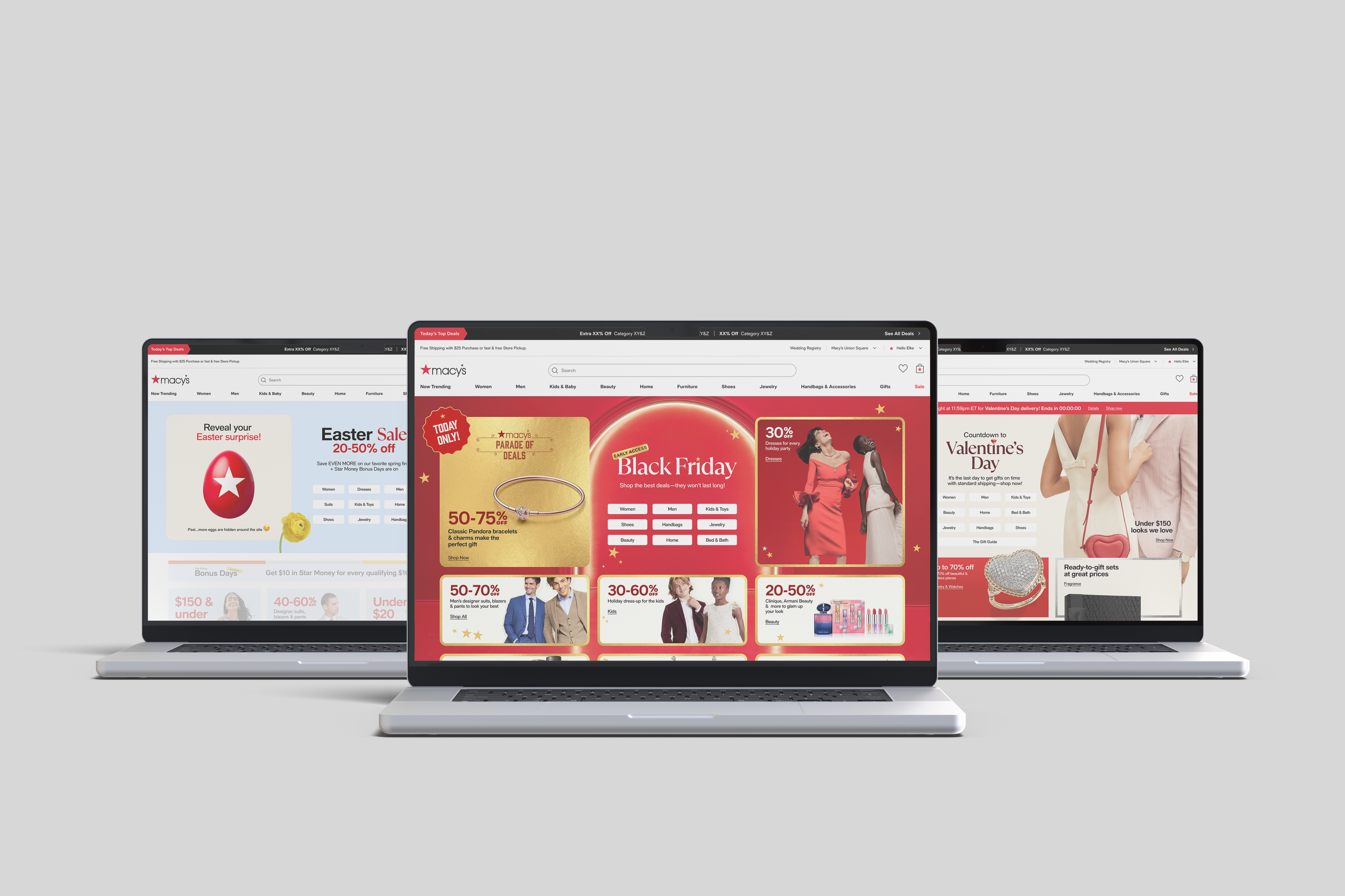
Designing for repeated use — not repeated effort
Promotional modules weren't built once — they were reused across multiple campaigns. From Black Friday to Valentine's to Clearance, each campaign introduced slight variations.
The challenge was building something flexible enough to flex, but structured enough to stay consistent.
Where the system struggled
Templates varied across campaigns
No consistency from one campaign to the next
Reuse required manual adjustments
Every reuse meant starting a conversation about what needed to change
Layouts became dense under pressure
High-volume moments broke the visual structure we'd built
Hierarchy shifted by campaign
What was prominent one week disappeared the next
My role
I designed and refined the promotional templates — working within Macy's existing system, not around it. That meant every decision had to hold up across Black Friday, Valentine's Day, Easter, and everything in between.
Each campaign was essentially a live test of how well the templates were actually built.
Design approach
The goal wasn't to make a beautiful one-off layout — it was to build something the team could hand off, reuse, and trust. That meant designing for the edge cases, not just the ideal version.
Every pattern needed to work whether the headline was three words or twelve.
The design
Evolving the system
System move 1
One primary message. Everything else supports it.
The homepage shifted from dense, competing promotional blocks to a cleaner hero-led structure — one primary message first, with supporting offers organised more intentionally below.
→ A single focus point made it easier for shoppers to know where to start.
System move 2
Less on the page — but the page works harder.
The homepage evolved from crowded, box-heavy compositions into a cleaner modular system — larger imagery, fewer competing elements, and more intentional spacing.
→ Improved readability and reduced cognitive load in high-density layouts.
System move 3
The same template, different campaign, same structure.
Black Friday and Valentine's Day shouldn't feel like the same page — but they should share the same bones. Refined layouts to support both high-volume and more curated campaigns.
→ The same template could flex across different campaign needs without breaking structure.
System move 4
Each campaign taught us something the last one didn't.
Each campaign was a live test. What held up got kept. What broke got fixed — reducing visual clutter and spacing inconsistencies across templates over time.
→ Improved readability and reduced cognitive load in high-density layouts.
What this project taught me
Designing systems isn't just about structure — it's about how they hold up over time and repetition.
01
Reuse exposes friction faster than planning
02
Systems don't fail in theory — they fail at scale
03
Consistency reduces decision fatigue — for users and for teams
The final experience
The same page, every campaign — just smarter each time.
Same components → less effort to build
Less effort to build → more time to refine
More predictable for users → more trust in the experience
Impact
— Consistent, scalable experience across campaigns
— Clearer promotional hierarchy across placements
— Reduced time spent rebuilding common patterns
Reflection
— The most durable work wasn't a layout — it was the logic behind it
— Real-world reuse exposed things planning never would
— A good system makes the next campaign easier, not the same
If there were fewer constraints
Dynamic templates by campaign type
Black Friday shouldn't behave like a normal week — the template should know the difference.
Clearer signposting for time-sensitive deals
When something expires today, that should feel urgent — not buried in the same layout as everything else.
Smarter content prioritisation
Surface what actually drives engagement instead of what's just newest.
Deeper personalisation layers
Make campaigns feel more relevant to the person seeing them, not just the campaign running.
Wedding Identity & Experience Design
A Design System
Applied to Real Life
I designed my own wedding using the same thinking I apply to product design — hierarchy, modularity, scalable components, reusable patterns. The medium was print and physical space. The output was a 3-day, 6-event, 400+ guest experience in Hyderabad, India. Every piece was part of one system.
The Challenge
A wedding is a product with a one-time launch.
6 events, 3 days, 400+ guests flying in from around the world — many attending their first Indian wedding, unfamiliar with South Indian tradition, who had never purchased Indian clothing. The problem wasn't just visual. It was informational, navigational, and deeply human. Somewhere in the planning, it clicked: this was the most meaningful design problem I'd ever been handed. And there was no iteration cycle. No second launch.
The brief, restated as a product problem
How do you build a system that works across 13+ touchpoints, scales from a 3-inch tag to a 4-foot board, holds across 6 different event contexts, and still feels personal without starting from scratch?
Multiple events, one identity
Mehendi, Haldi, Sangeet, and the wedding ceremony — each with its own tone, needing to feel part of a single cohesive world
Cross-cultural audience
Guests from multiple countries, cultural backgrounds, and varying degrees of familiarity with South Indian tradition
No room for iteration
Unlike product design, there's one shot — the day is fixed, the invitations go out, the signage goes up
Scale without repetition
Invitations, signage, wardrobe guides, programs, menus, social assets — everything must cohere without feeling templated
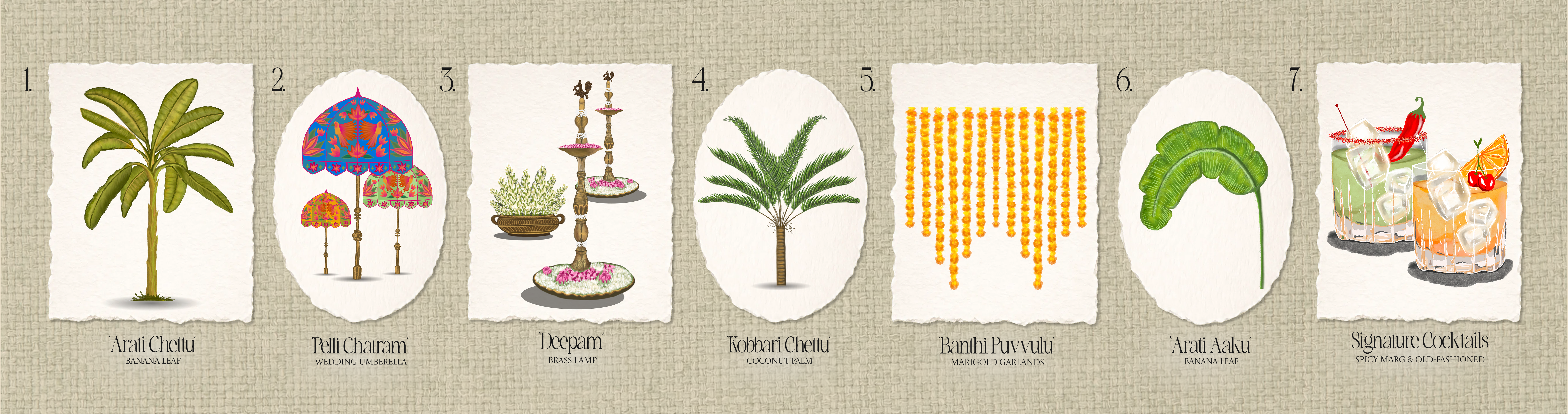
Section 2 — The Component System
Building the component library
I wanted the typography, illustrations, and design language to become recognisable enough that when guests saw them, they immediately thought of our wedding — my wedding. Not just a pretty invitation — a visual system with enough internal logic that it could scale across dozens of touchpoints and still feel intentional.
Events designed
6
Pellikuthuru to After-Party
Custom illustrations
20+
hand-crafted icons & motifs
Touchpoints
13+
print, digital, interactive
Vendors curated
14
shipping to US & internationally
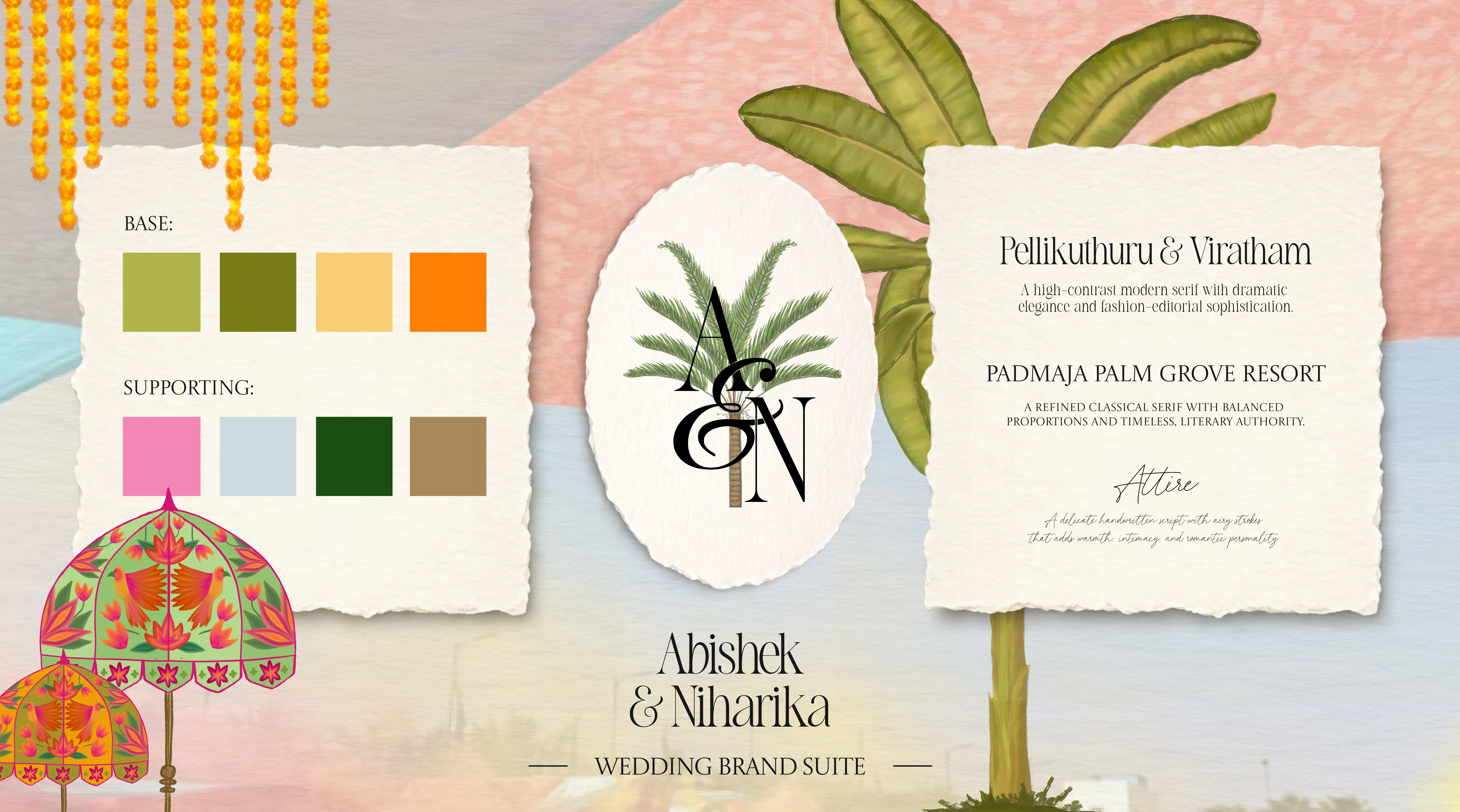
The components
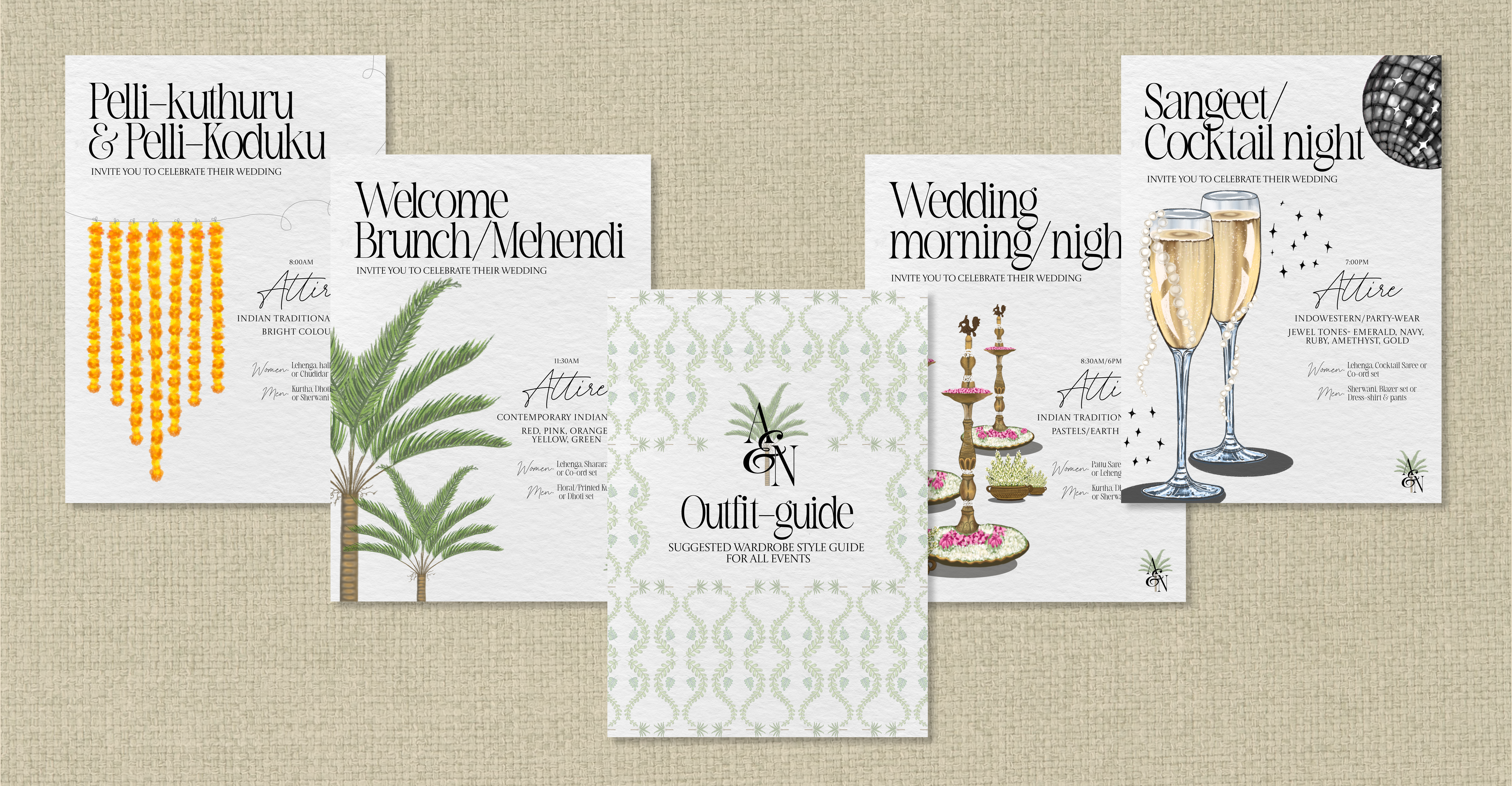
Type system — three voices
Editorial serif for event titles. Script for "Attire" and subordinate labels. All-caps sans for functional information. Each voice has a role; none are interchangeable.
Colour system — base tokens + event extensions
Botanical green, marigold, parchment as the root palette. Each of the 6 events inherits from the same anchors but with its own dominant tone — exactly how a themed design system works.
Logo — one integrated mark
Palm trunk running through the A&N ampersand. Reduces from a 4-foot backdrop to a 5mm wax seal without modification. Designed to be placed, not resized.
Arch — the layout grid
The scalloped Mughal arch acts as the structural frame for every output — invitation spreads, welcome boards, and even the die-cut shape of the hamper tag. One component, used at every scale.
Section 3 — The Asset Library
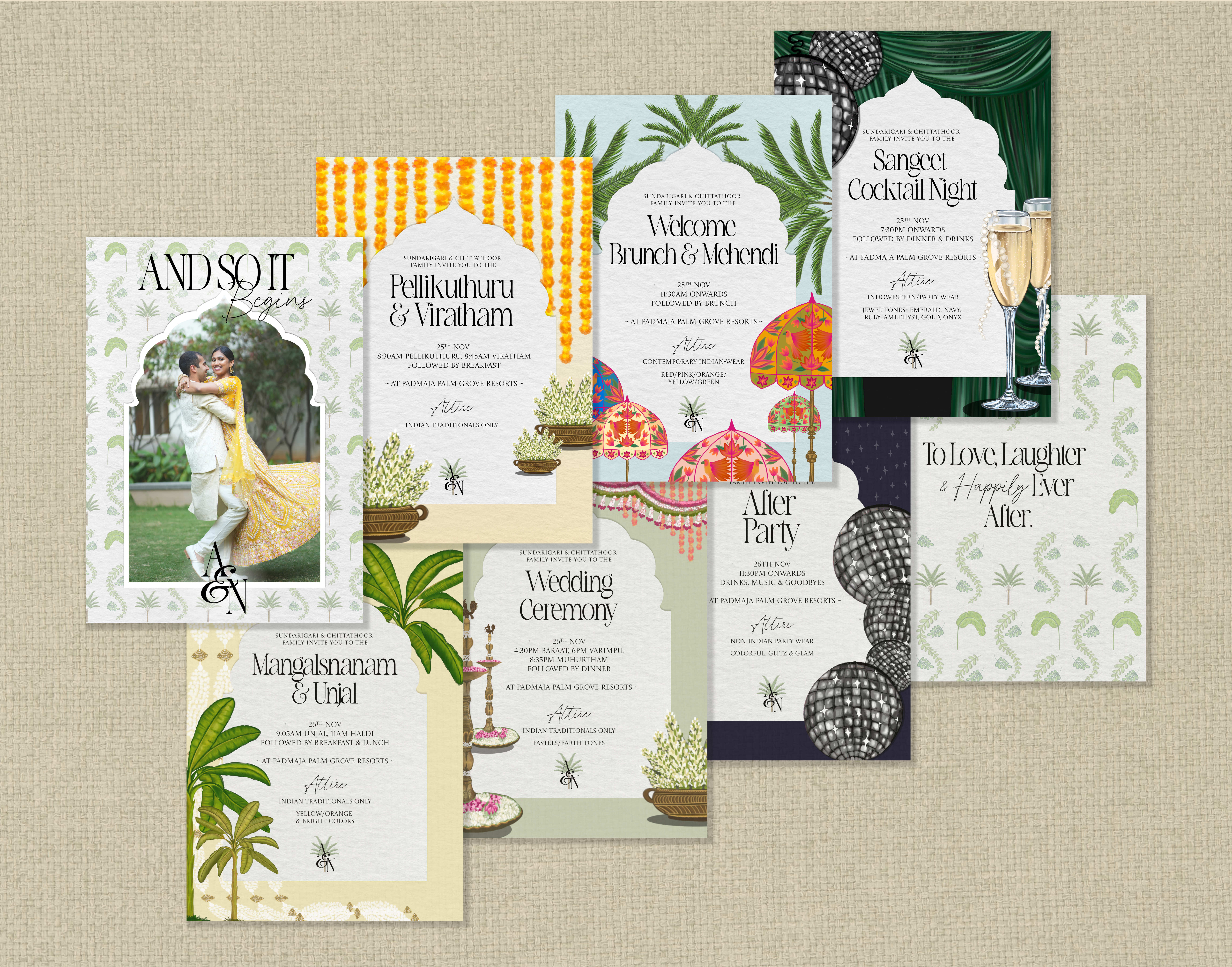
Custom assets, built to be reused
The invitation suite is a 6-event booklet — each spread a completely different world, but all held together by a single structural device: a scalloped Mughal arch that frames every event's information. The arch is the constant. Everything around it changes — background colour, illustration set, palette — event by event.
The arch went further than a graphic motif. The hamper tag given to every guest was die-cut into the arch silhouette — the shape of the design system became the physical shape of the object. 400+ guests received a tag that was, structurally, the same form as every invitation and welcome board they encountered across three days.
Every illustration was drawn to be reused — specific enough to signal an event's mood, modular enough to work across every touchpoint in the system.
The palette is a record of the place
Botanical green from banana leaves. Marigold from the flower garlands. Parchment from brass lamps and jasmine. The palm motif from the resort venue itself. Nothing chosen for aesthetics alone.
Build once, deploy everywhere
Each illustration appears across the invitation, the welcome board, the itinerary, and the wardrobe guide — pulled from the same library, resized, never redrawn.
Pellikuthuru & Viratham
Marigold garlands, jasmine pots, warm cream — the most traditional spread
Welcome Brunch & Mehendi
Sky blue, palm fronds, phoolkari umbrellas — festive arrival energy
Sangeet & Cocktail Night
Deep emerald, disco ball, champagne flutes — the most editorial spread
Mangalsnanam & Unjal
Pale yellow, banana leaf, pearl-and-gold strings — soft and ceremonial
Wedding Ceremony
Sage green, floral canopy, brass deepams — the most culturally precise
After Party
Deep navy, disco balls only — a complete tonal break into Western party-wear
Section 4 — Onboarding Documentation
The wardrobe guide
Many guests had never attended an Indian wedding, let alone a South Indian one. They didn't know the difference between a lehenga and a sharara, couldn't picture what "jewel tones" meant in this context, and had no idea where to shop from the US. The wardrobe guide became the most impactful single deliverable of the entire project — and the one that received the most direct feedback.
Each of the six events got its own illustrated spread: event name, timing, dress code, colour palette, and exact garment terminology for both men and women — specific enough to search for directly online. The final page was a curated vendor list of 14 stores that ship internationally, with practical tips on ready-made vs custom stitching, pre-draped saris, footwear for long distances, and how to use a measurement guide. It read less like a dress code and more like a guide written by someone who genuinely wanted guests to feel prepared — because that's exactly what it was.
What the wardrobe guide included
Per-event illustrated spreads
Each of the 6 events had its own page — event name, time, colour palette, garment names, and a custom illustration signalling its mood
Exact garment terminology
Lehenga, sharara, pattu saree, half-saree, kurtha, dhoti, sherwani — specific enough to search directly, with separate guidance for men and women
14 curated vendors
International shipping, all price ranges — with practical tips on ready-made vs custom stitching, pre-draped saris, and footwear for long distances
Colour mood by event
Bright traditionals for Pelli-kuthuru, jewel tones for Sangeet, pastels for the wedding ceremony — each event's palette made the mood immediately readable
"I could actually search for things online from the US and know exactly what I was looking for. I had no idea where to even start before this."
Friends attending their first Indian wedding, travelling from the US to India for the celebration — and experienced Indian wedding guests noted it was one of the most detailed guides they'd received, helping them understand the specific colour theme and mood of each event.
Section 5 — Guest Navigation
The same principles as digital — applied to print
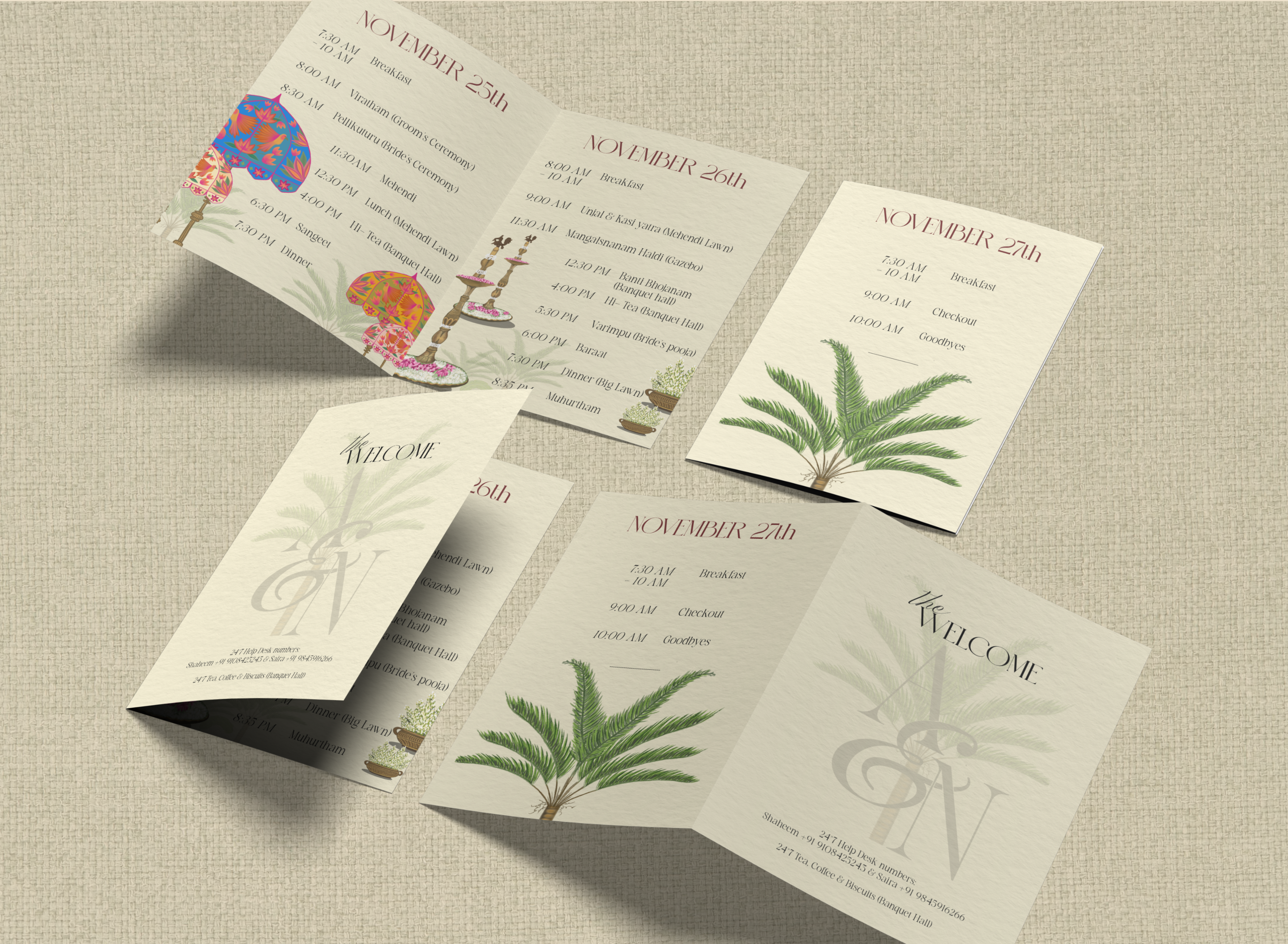
The product design thinking lives here. Three days, 20+ distinct moments across multiple venues — guests needed to know exactly where to be, when, and what it meant, without asking anyone. Each itinerary was designed as a standalone daily schedule: the date in a terracotta display serif at the top, times in italic, event names in upright weight, locations in parentheses. Time vs event vs context — scannable in a glance, no reading required.
Day 1 runs from 7:30AM breakfast through the Sangeet at 7:30PM. Day 2 holds 8 events including the Muhurtham at 8:35PM. Day 3 is a single page — just breakfast, checkout, and goodbyes — and that restraint is a design decision too. Each page carries a different illustration from the system: umbrellas for Day 1, brass deepams for Day 2, just a palm for Day 3. The visual hierarchy shifts with the emotional weight of the day.
Scannable, not readable
Three hierarchy levels — time in italic, event name in upright weight, location in parentheses. A guest could find their next event in under two seconds without reading a sentence.
20+ moments across 3 days
The itinerary covered every moment from 7:30AM breakfast on Day 1 through 10AM goodbyes on Day 3 — including venue names, ceremony timings, and meal locations — all on three pages guests could fold and carry.
Section 6 — Multi-Touchpoint Experience Design
The full guest journey
Every touchpoint was designed as part of one continuous experience — from the moment guests received their save the date to the last photo they shared online.
Save the Date
Motion reel — the first impression of the visual world
Invitation Suite
6-event booklet — each spread its own colour world, same arch, same system
Wardrobe Guide
Per-event attire direction, garment terminology, 14 curated vendors, shopping tips
Itineraries
3-day illustrated schedules — 20+ moments across multiple venues, scannable at a glance
Welcome Boards
Per-event signage at full print scale — illustration system and original copy at the venue entrance
Menus
Food menus, bar menus, and a signature drinks card with illustrated cocktail art
Hamper Tags
Die-cut into the arch silhouette — 400+ guests, one physical object, the same form as every other touchpoint
Interactive Game
Mehendi trivia board — 25+ envelope pockets, designed to connect two groups of friends
Social & Motion
Save-the-date reel, Instagram posts, typography animations — identity extended into digital
What makes this work
Coherence without repetition
The arch is the system — in two dimensions and three
The scalloped Mughal arch frames every invitation spread, every welcome board, and every itinerary. One structural device, holding six completely different worlds together.
Illustrations communicate without text
Marigold garlands read as tradition, disco balls read as nightlife, brass deepams read as ceremony — the visual language is legible even across cultural backgrounds, without needing a single word of explanation.
The palette extends, not repeats
Warm cream for Pellikuthuru, sky blue for Mehendi, deep emerald for Sangeet, pale yellow for Mangalsnanam, sage for the ceremony, navy for the After Party. Six distinct worlds — one coherent identity running through all of them.
The writing is part of the design
Every welcome board carries original copy written to match that ceremony's emotional register — "A morning of traditions wrapped in grace," "Love in balance, blessings in motion." The words and the visuals were designed together, not separately.
Section 7 — Environmental Storytelling & Interactive Design
Translating identity into physical space
Every event had its own welcome board — designed in the same arch-and-illustration language as the invitations, printed at full scale, installed on gold easels, and carrying original copy written for that ceremony. The design didn't end at the invitation. It was waiting for guests when they arrived.
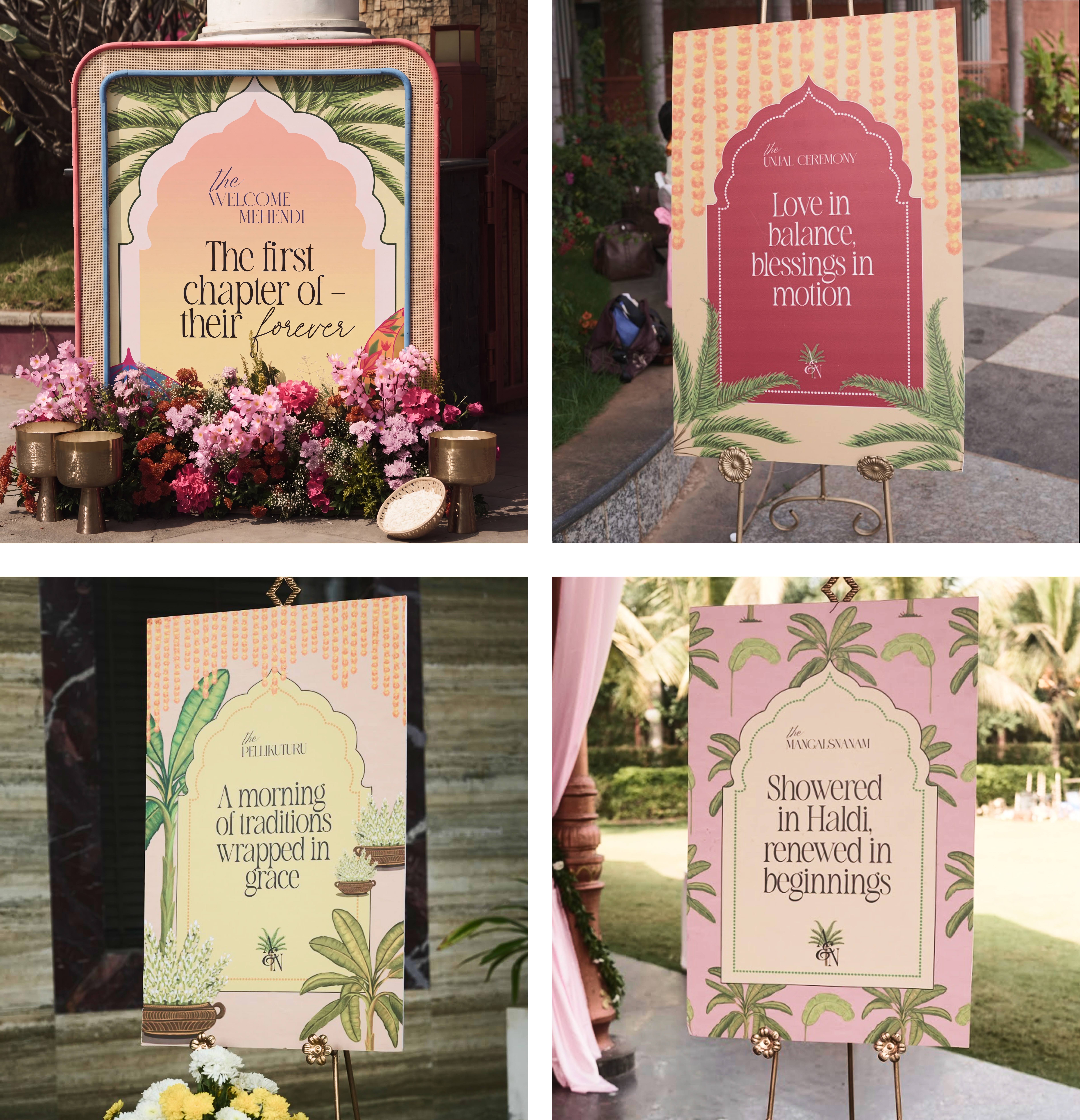
Pellikuthuru
Warm cream + botanical green — "A morning of traditions wrapped in grace"
Mehendi
Sandy blush + arch frame — "The first chapter of their forever"
Mangalsnanam
Dusty pink + botanical tile — "Showered in Haldi, renewed in beginnings"
Unjal Ceremony
Terracotta + marigold + palm fronds — "Love in balance, blessings in motion"
Wedding Ceremony
Sage green + floral garland canopy — brass deepams and jasmine flanking the arch
Interactive installation — Mehendi
Designed to get people talking
A large freestanding board with 25+ pink envelope pockets in a grid, each sealed with a gold wax seal — "Abishek & Niharika: How well do you know them?" Each card was individually assigned to a specific guest: "This question must be answered by Niharika's Dad", "Abishek's Mom", "New York Friend". The assignment meant every person had to find their envelope, and could only answer the question inside it — pulling people into conversations they couldn't opt out of, with questions only they would know the answer to. Guests who had never met were suddenly comparing notes. The board used the Mehendi illustration system and was designed to do something the other pieces couldn't: get two groups of friends who didn't yet know each other to actually interact.
Bar program — Sangeet
The system at 10pm
Three menus — alcoholic, non-alcoholic, and signature drinks — each typeset in the same script-and-all-caps system used across every other printed piece, against the Sangeet's deep emerald palette. The signature menu featured bespoke illustrated cocktail art. The Bride's Pick: "Tequila. Lime and a little bit of a kick. A bold choice." The Groom's Pick description: "Just drink it." — Groom.
Section 8 — Menus, Motion & Social Storytelling
Extending the identity into every surface
Motion extended the identity into digital — a save-the-date reel, invitation motion graphics, Instagram posts, and typography animations, all carrying the same visual language as the print system.
Save the date reel
Wardrobe guide motion
Illustration system
Response
What the work produced
Identity held at every scale
From a 5-inch booklet spread to a 4-foot venue welcome board — the arch, illustrations, and palette held without modification. No redesign for print scale.
System adopted across 6 events
The same visual language ran through every touchpoint — invitations, wardrobe guides, welcome boards, menus, programs, motion assets, and social content.
Wardrobe guide reduced friction significantly
Both first-time Indian wedding guests and experienced attendees called it one of the most useful and detailed guides they'd received — useful enough to shop from directly, in the US, before travelling to India.
Work received as fully professional
Guests and vendors assumed the work was produced by a hired studio. The system held under real-world production conditions — printed at scale, installed outdoors, photographed, and shared widely.
Interactive game created genuine connection
Each of the 25+ question cards was assigned to a specific guest by name — so finding your envelope and answering was unavoidable. Guests who had never met ended up comparing answers. Two groups of friends, pulled into conversation by design.
Print exposed what screen-testing never would
Once something is printed at 4 feet and installed outdoors, you can't iterate. That constraint sharpened every decision — hierarchy, contrast, copy length — in ways a Figma review never could.
What this project taught me
The most meaningful project I've ever designed — and the one that taught me the most about how I actually think.
Design systems aren't limited to digital
The same principles that create consistency in product design — hierarchy, scalability, modularity, reusable patterns — create richer, more cohesive experiences across physical and digital environments.
A strong system makes every touchpoint easier
When the system is solid, individual deliverables almost design themselves. The work accelerates — and the experience feels authored, not assembled.
Map the journey before designing any touchpoint
The ecosystem map came together late. Had I built it at the start, earlier decisions — illustration scope, palette extensions, print specs — would have been sharper.
Complexity can feel simple with the right information design
The wardrobe guide and itineraries proved that UX thinking belongs in print — scannable hierarchy, progressive disclosure, and clear wayfinding matter just as much off-screen.